Data visualization example
$7.5M
Immediate savings
4
Hours
2
User interviews
My responsibilities
Data visualization
Python + Dash
Prototyping
Analyzing real data
User research
The problem
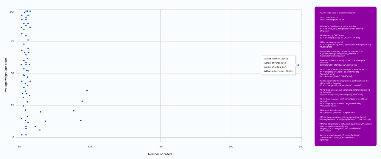
LyondellBasell customizes a large number of petrochemicals, and receive thousands of their materials from numerous different vendors. Each material from each vendor is individually qualified for USMCA, which allows the item to be sold in North America without a tariff. The supply chain group is responsible for verifying qualifying materials, as well as investigating which materials can be converted to a qualifying material. They request a data visualization that allows them to see the materials that would make the biggest impact.
The research
While meeting with the internal client, the supply chain team was very vague on which visualization was needed to solve their problem. After listening to their grievances, I determined that a scatter plot was needed, since two variables were needed - number of orders, and average weight of material per order. They were unclear if that would solve the problem.
The solution
I realized that they needed to see the solution, with real data, in order to determine its effectiveness. I aggregated the previous years’ real data in Python, and it quickly showed a huge outlier. One unqualified material was in over 250 orders. If this one material was converted to a USMCA qualified material, it would save the company an estimated $7.5 million in tariffs. The end user immediately recognized that this visualization solved their issue and added a lot of value to the existing program that was being built. Had I used dummy data, the end user wouldn’t have immediately seen the value of the visualization. As an added bonus, I was able to hand off the commented Python code to the dev team, saving them time as well.