Case study: Energy intensity
22
Screens
1
Large brainstorming session
3
User interviews
9
Usability tests
2
Design reviews
6
Weeks
The problem
Users relied on outdated data for large furnaces, and no central location for the thousands of data tags on each piece of equipment. In addition, some of the data isn’t an adequate comparison to other furnaces, especially if they’re consuming different feeds or are different configurations. Users want to know which pieces of equipment are performing well - need less time to clean and maintain, using less energy, and producing more to sell.
Their previous solution (to the left, some items blocked out to protect the actual data) was a slow Power BI that was put together by a couple of interns, who didn’t understand the user or the business. As such, their solution missed some key issues. Also, it was void of best practices for data visualization. It had a bright blue background (the background was simply not important, and that’s a LOT of attention drawn to the background). The graph showed about 10 different metrics, all on the same y-axis - when the axes differed greatly. The colors used for the visualization didn’t follow accessibility guidelines.
My contributions
Since we had a small team (only four designers, each already managing multiple products), I performed most of the activities, with a junior designer assisting with mainly the tooltip creation and interaction.
Prepare for and facilitated brainstorming session
Conducted one-on-one user interviews
Disseminated and organized
user requirements
Coordinated with stakeholders and developers to determine priorities
Created personas, journey maps,
and user flow
Created initial wireframes
Prepared for and conducted
usability testing
Iterated and prepared prototypes
and marked “Ready for Dev”
The research
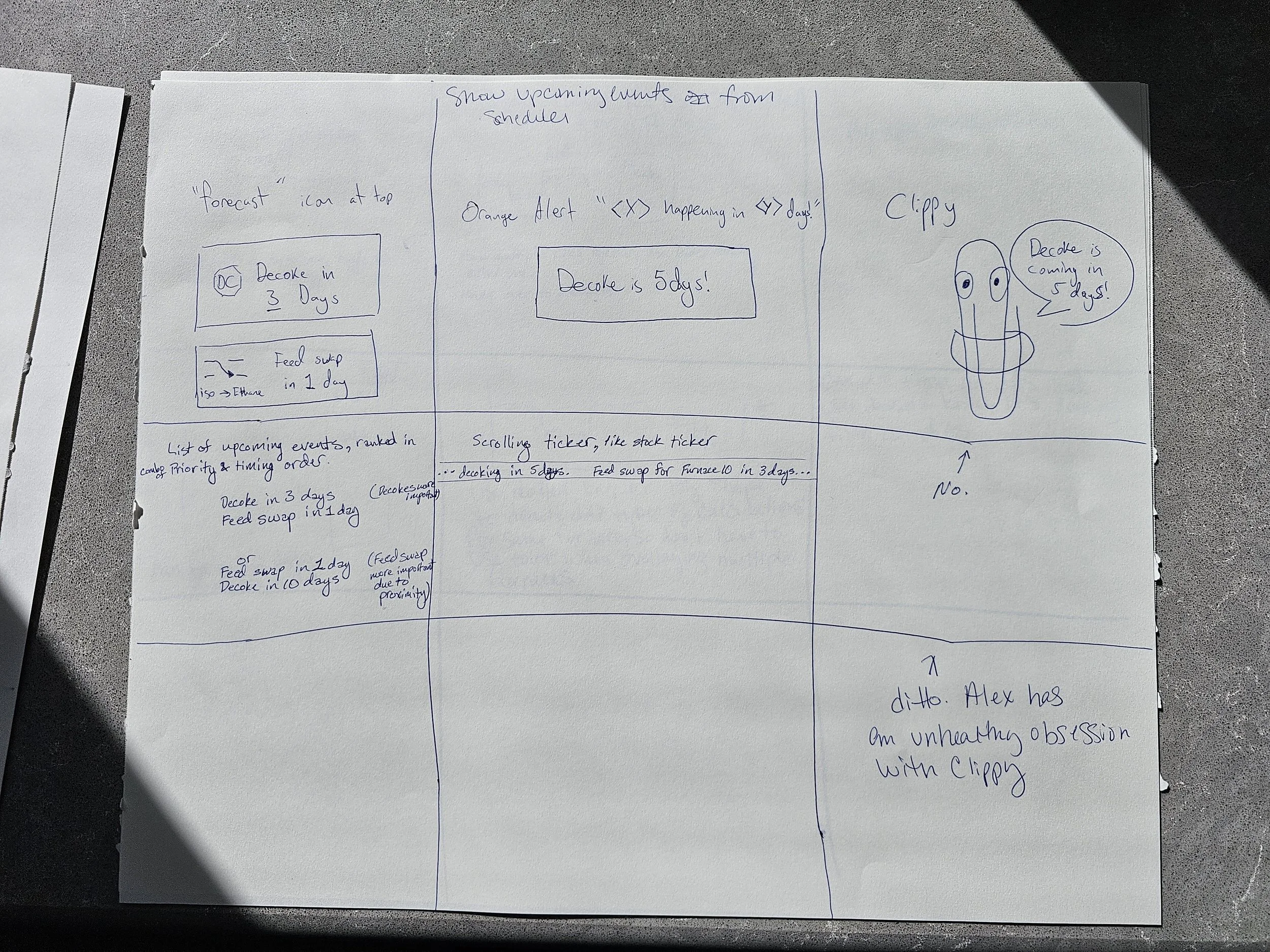
Held a 4-hour brainstorming session, gathering as many end users as I had access to, as well as a stakeholder and another designer. After going over ground rules for the session, we started handing out post-its. A LOT of post-its. One color for process, one color for pain points, one color for requests/requirements.
Attendees started listing their process in post-its on one wall, then we went on to pain points, then requests/requirements. As they’re listing, I’m encouraging them when they get stuck, and organizing like items.
Once the requirements are listed, I separated that wall by horizontal tape, for Must have, Should have, Could have, and Would not have. As a team, we prioritized each request. As per usual, 75% of requests are in the Must have section. I gave each attendee 3 dot stickers, and had them put the dots on the most important request(s).
The final part of the brainstorming session was everyone’s favorite. Each person got to pick out a must-have requirement off the wall. Everyone got a large sheet of paper and a pen, and they separated the paper in 9 equal parts. They each had one minute to visualize three possible solutions. Then everything was passed to the right. The next person was instructed to expand on the previous person’s ideas - they had one minute. And then repeat. This gave some insight into the end users, and some possible solutions to the problems.
The artifacts
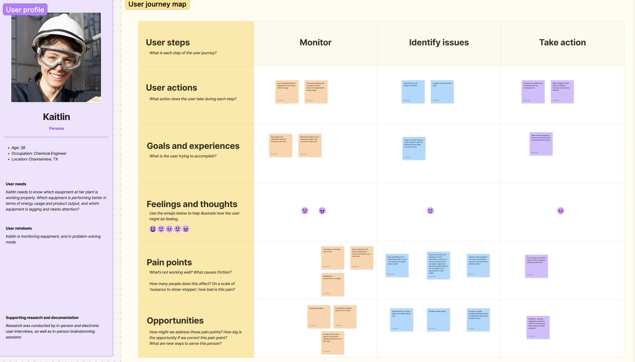
Collaborating with another designer, we created two personas and journey maps. One for a chemical engineer, who’s interested in their specific site, and one for a regional manager, who’s interested in all the sites in his region.
After the brainstorming session, I typed up all of the post-its, and took the requests/requirements to the engineering team to determine level of effort and feasibility.
Taking into account level of effort, feasibility, and users’ priority, a list of high-priority (Must have) requirements are created, and now user stories can be created, along with a user flow.
Note: I’m aware that a business analyst would usually perform some of these tasks, but we didn’t always have that luxury.
The results
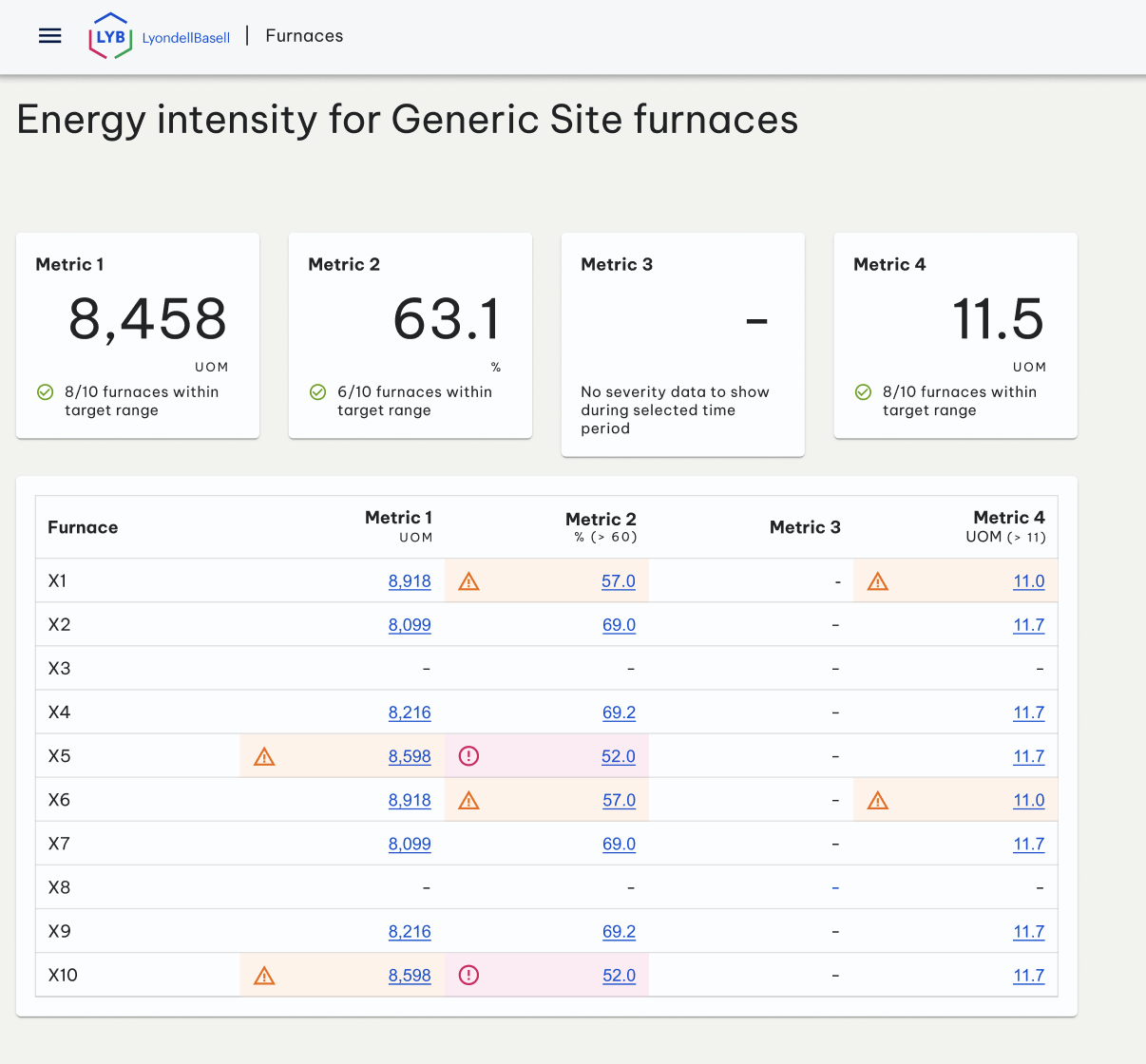
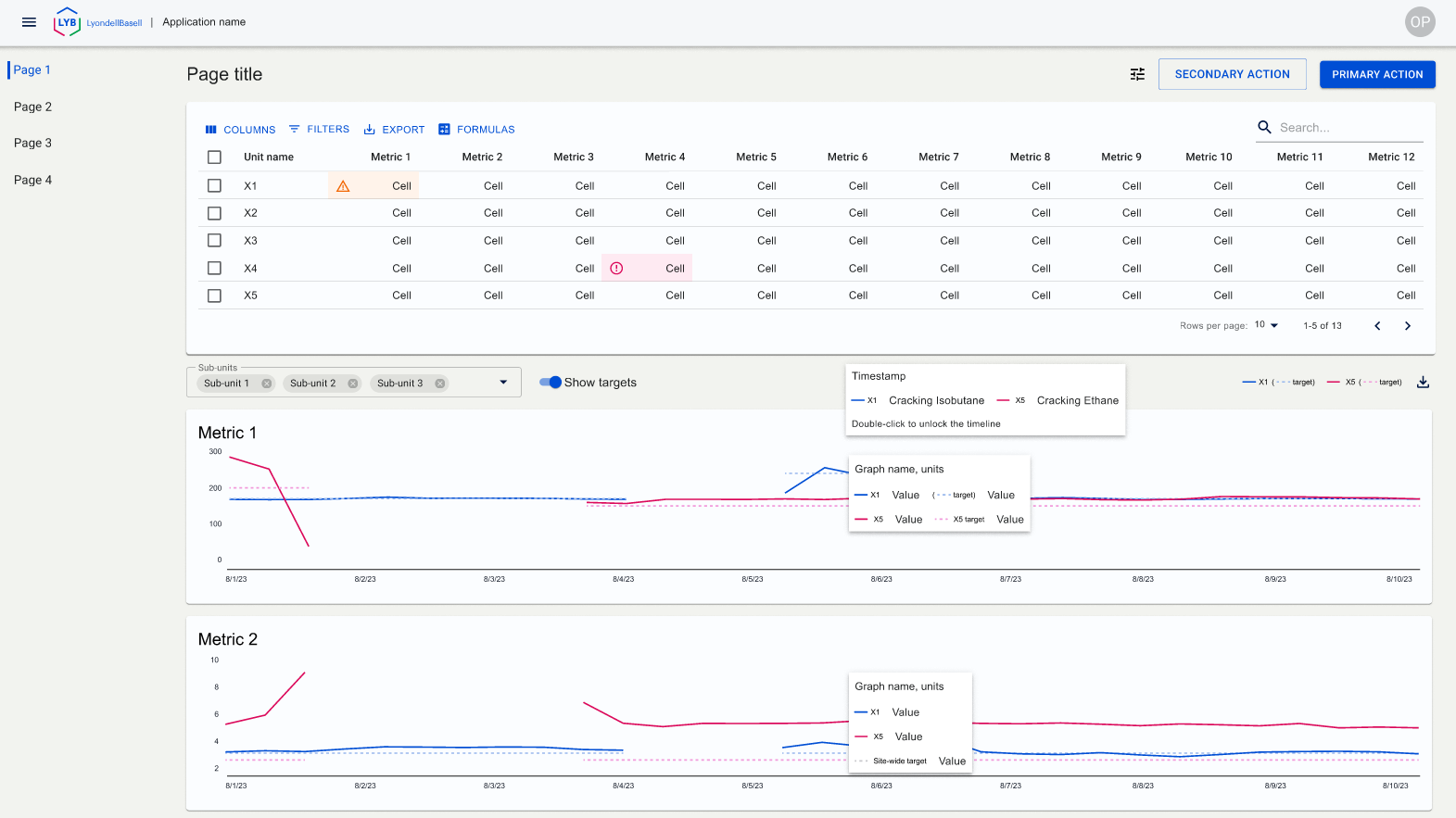
After a couple of iterations on the unit page, it worked best to show all of the high-level information on a table. Remove the severity on every cell, and only show severity when it’s warning or error. This allows the user to quickly see what needs attention.
A link is added to each metric that goes to that particular furnace, on that metric’s tab.
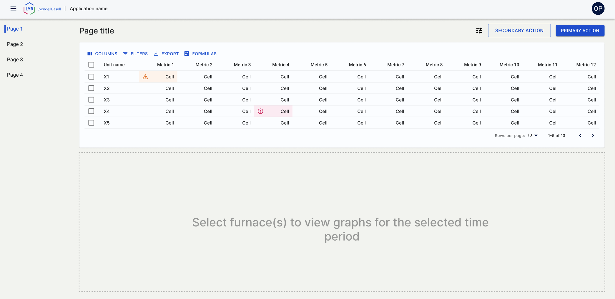
I had to remove labels, etc from these prototypes due to the confidentiality of the information. In that process, the tabs between the title and table were incidentally removed. This screen shot is representative of the remaining tabs. User can select up to 6 furnaces to compare. User can also modify columns (remove, add), and the graphs below will be in accordance with the table.
One of the requirements was to show and change how energy intensity is calculated, as it can be calculated several ways. During usability testing, it was found that the icon for that (initially in the top left) was in the wrong place - it needed to be closer to the content, and we placed it in the toolbar on the table.
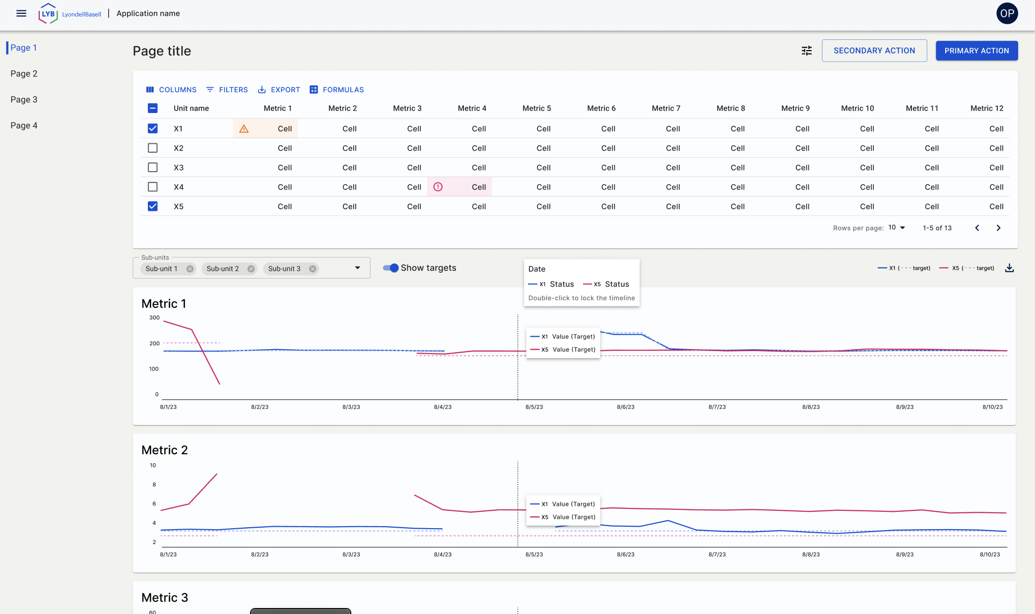
User is able to further filter the graphs by feed (which was an important user requirement), using the select box + chips between the table and graphs. User is also be able to double-click to keep the coordinated tooltips locked, so they can compare the detailed information at points of interest.
The aftermath (Design System)
Wireframes were reviewed with the remaining designers when they were in teh initial phases, as well as close to completion, to ensure they were compliant with the Design System (I created the bulk of the Design System, so there weren’t many discrepancies - mainly working with the other designers to make sure the additions worked for everyone).
Two items were added to the Design System based on this project. One was the severity cell. This added a severity design to an individual table cell, to show the user that it needed attention. This was later widely used on almost every project thereafter.
The other was the integrated tooltip that followed several graphs, with the interaction to allow the user to lock it. This was also widely used, as most of our projects used a multitude of graphs.