LyondellBasellHow I uncovered $58.5M in projected savings with data viz
Context: Petrochemical furnaces are among the most expensive assets in industrial operations. Each one runs a feedstock like ethane or butane, which often changes how they behave. The gap between a furnace running well and one running badly is enormous, and it's invisible.
Problem: Engineers couldn't tell how their furnaces were performing. The existing tool ran on month-old data and presented it in a way that led people to the wrong conclusions.
What I did: I ran the requirements workshop that set product direction, then designed the tool around feed separation so engineers could compare furnaces. I then built out components and code in the design system.
Impact: The platform was projected to save $58.5M annually, and it gave a engineering teams a shared operational language for the first time.
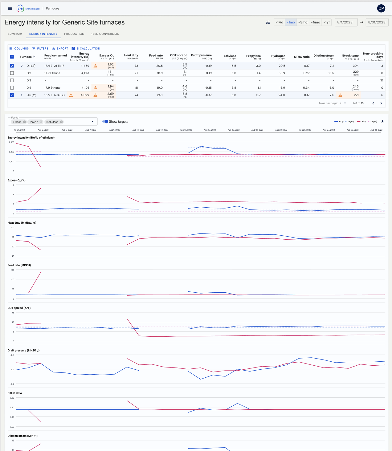
Role: Principal Product Designer | Year: 2024 | Duration: 6 months

$58.5M
projected cost savings
A tool to save millions existed, but nobody used it
Engineers needed a way to see how their furnaces were performing. The tool built to show them went unused.
The previous dashboard was built by interns who didn't know the business, ran on month-old data, and couldn't give engineers any relevant answers.
These furnaces run on different feedstock, ethane, isobutane, and others, and each feed produces completely different performance characteristics. Without a way to isolate feed types, any comparison between furnaces was meaningless regardless of how good the tool was.
Sites ran on local knowledge. What worked at one site never traveled to another, so nothing improved.
What's at stake: The inefficiency costs $58.5M a year, and engineers can't act on what they can't see. Building the full furnaces platform was projected to recover it.
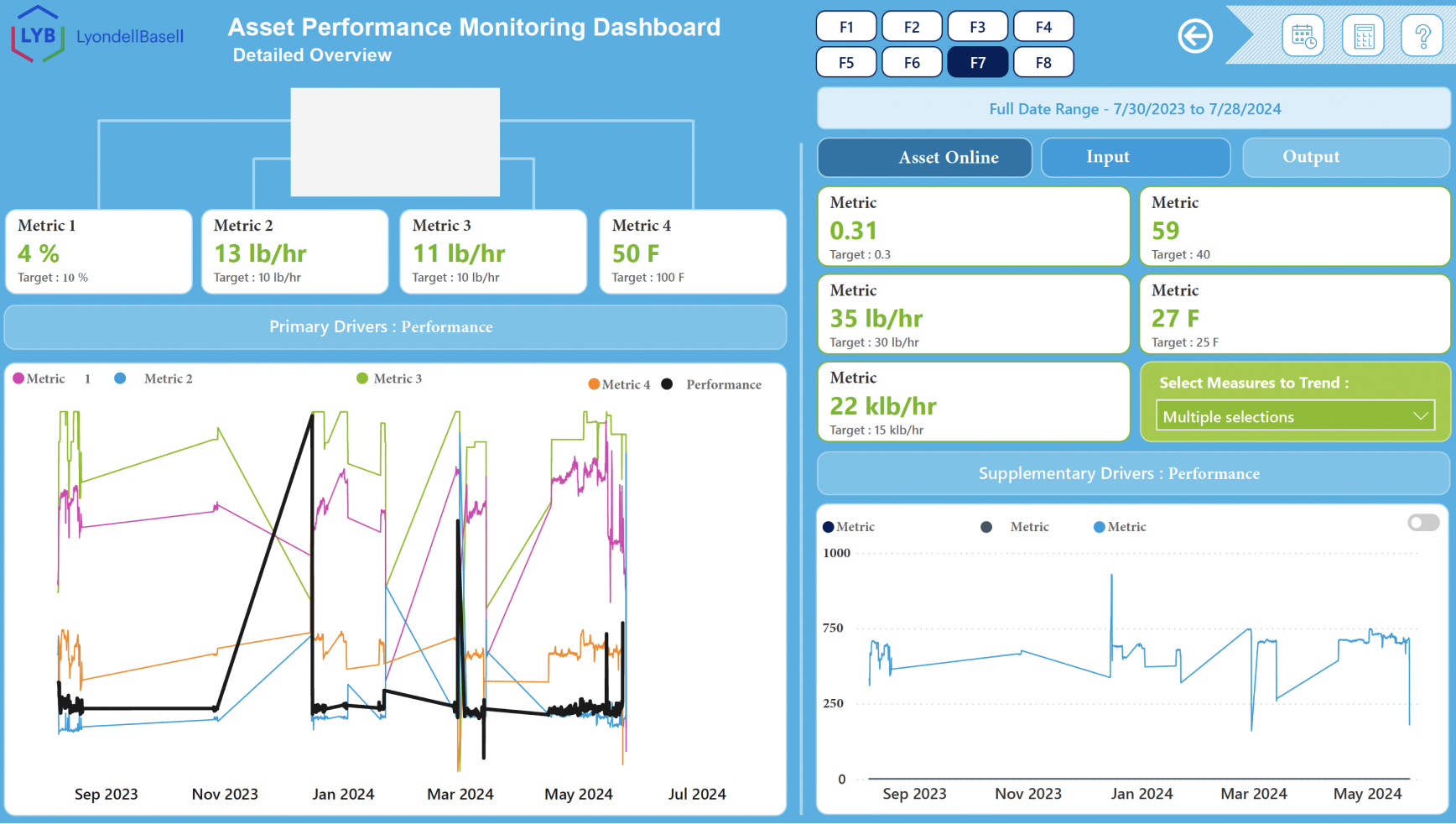
Previous tool (not my work)
Catching drift before it becomes damage
It's the first week of the month. Caitlin, a chemical engineer, sits down to review how her furnaces performed over the last 30 days. Nothing is on fire. No alarms have gone off. But one furnace has been quietly running above its energy intensity target for three weeks.
Half of Caitlin's bonus moves with how her site performs, and these are not small bonuses. Slow drift is a personal financial problem for her.
Without the right tool, that pattern stays invisible, buried in a spreadsheet or not tracked at all. There's no way to know whether the issue is the feed type, the coil temperature, the draft pressure, or something else.
Caitlin often monitors many furnaces, and every site was working this out alone. There was no shared baseline, and no tool built to give her the answers she needed.
Four decisions that changed everything
Decision 1
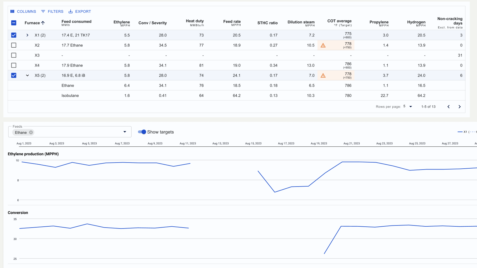
I separated the graphs by feed type. A furnace running ethane one week and isobutane the next produces a line that looks broken. Engineers couldn't tell bad performance from a feed change, so every comparison was false. The feed filter isolates one feed across all graphs.
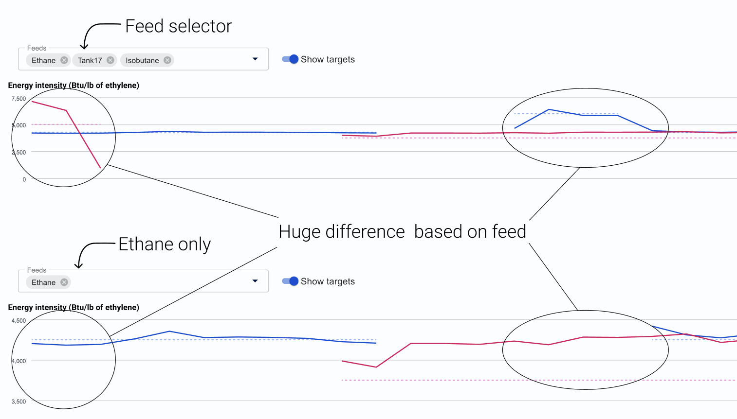
Decision 2
I designed the summary page to surface warnings first. Stakeholders wanted green lights everywhere (image on the left). I built both versions, put them side by side, and they picked mine immediately.
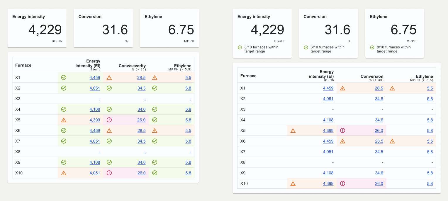
Decision 3
I used production data instead of placeholders. Show an engineer a number that would never appear in their system, and it's the only thing they'll talk about. Real data also surfaced a dual y-axis problem that placeholders would have hidden.
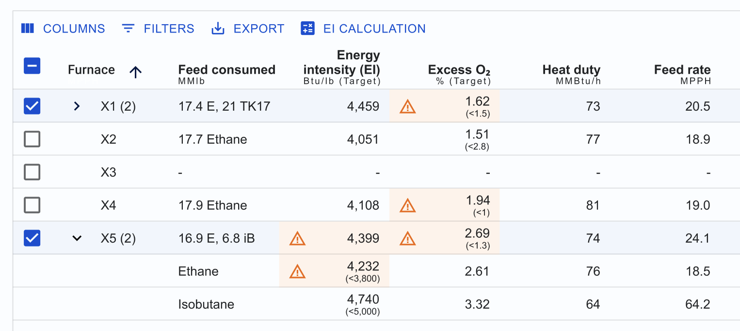
Decision 4
I gave engineers control over what they see. The table columns drive the graphs. Reorder a column and the graphs reorder. Hide one and its graph goes with it.
What it produced beyond this project
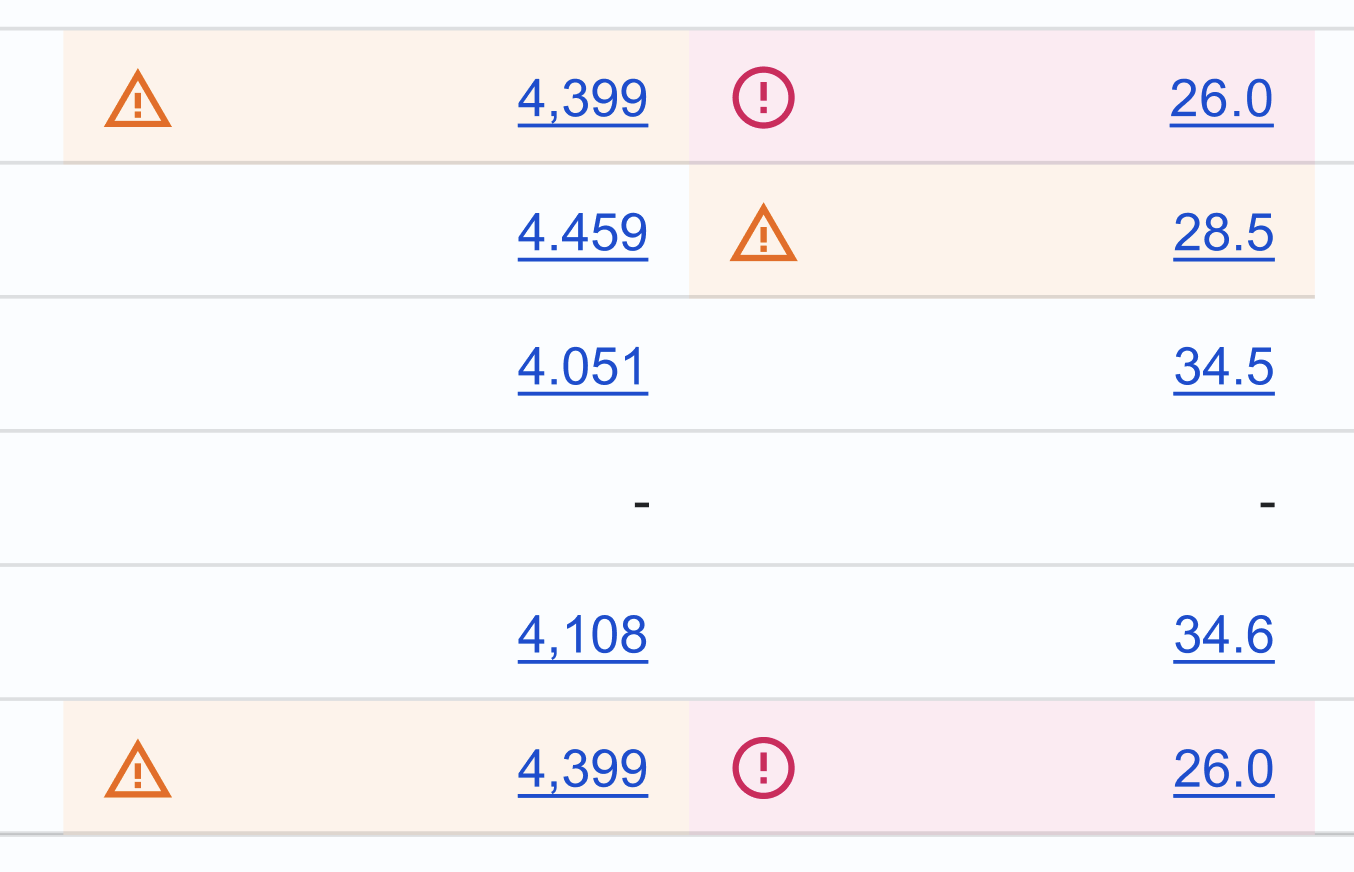
The warning and error severity cells I built here became a design system component and code available to every team.
What the re-design unlocked
The design was finished in six weeks and validated across three sites. Nine engineers used it against their own furnace data and the design held; two small changes came out of testing.
The platform never fully shipped. Development had started when the contractor team was cut.
What survived is the severity cells. They became a variant on the shared table cell component, available to every team on the system, including teams that never touched a furnace.
The $58.5M was never a savings the dashboard would produce. It was the size of what engineers couldn't see.